

LEYTONSTONE LOFT
The Leytonstone Loft adds a modern element to its original Victorian property, which presented some interesting challenges but resulted in an equally interesting loft conversion and extension.


COMPACT AND COMFORTABLE
This Victorian property in Leytonstone presented some interesting challenges which resulted in an equally interesting loft conversion and extension. The two-storey, two-bedroom house has a fairly narrow structure with a long garden providing privacy and enclosure at the rear. An extra floor in the loft would provide a master bedroom with ensuite and a spare bedroom, turning the compact but comfortable home into a much more spacious abode for a family. This was a project that used every inch of space purposefully and intentionally, but with thoughtful design that made it feel warm and generous in its functionality.


THE STAIRCASE AS STARTING POINT
So that the owners didn’t lose any space on the ground floor, there was only really one place for the staircase, which was the existing location. This was perfectly fine and logical for configuring the loft space, however, as is often the case with loft conversions, this can pose an issue from a health and safety perspective because the staircase is directly connected to the kitchen, which then requires a fire door. To resolve this, we fitted a misting system into the kitchen ceiling. The system is discreet and simply looks like extra spotlights, but means there’s no need to lose floorspace to sectioning off for a vestibule or to consider a door at the foot of the staircase.


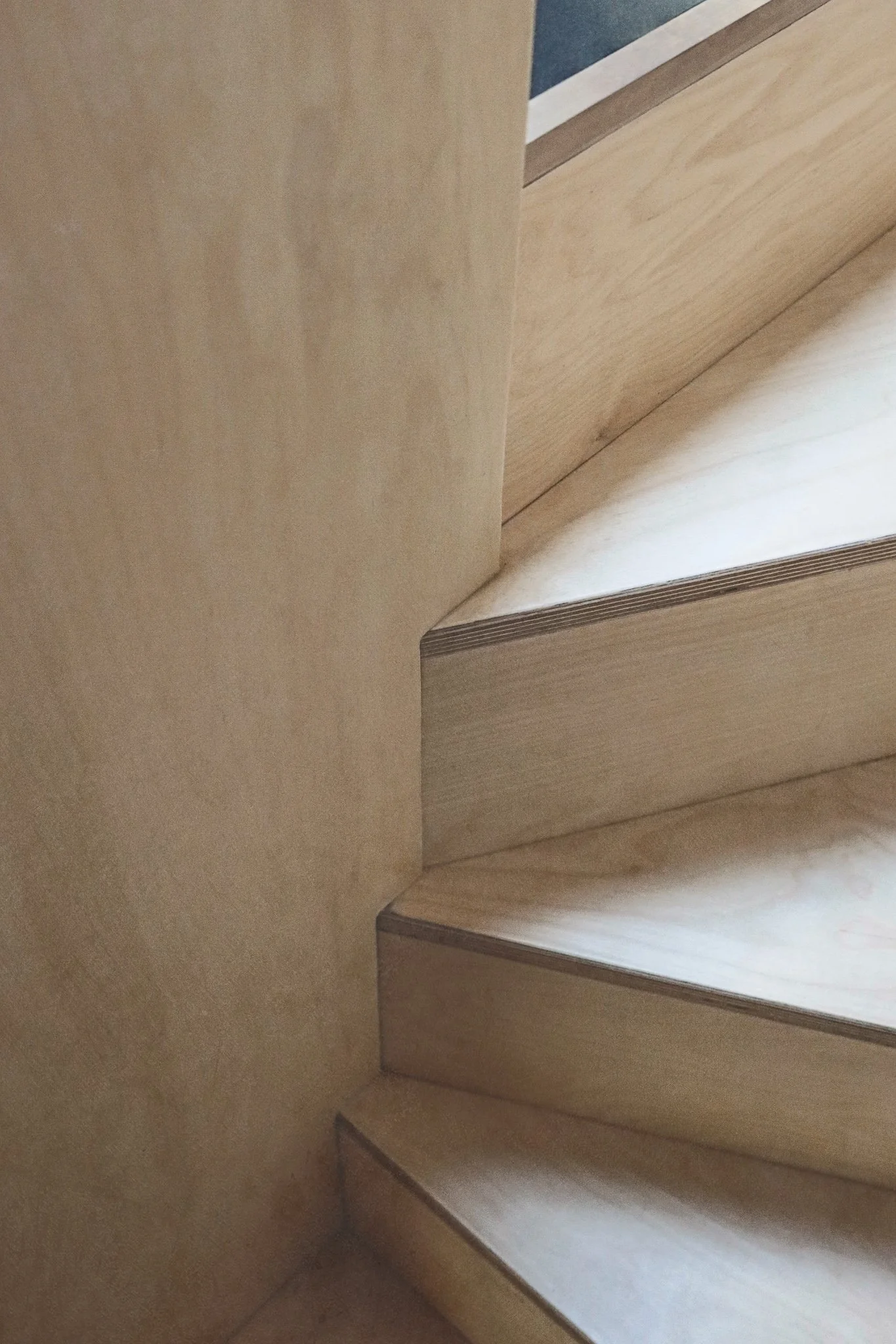
The staircase itself was clad in ply to give it a sturdiness and solidity that ran from top to bottom. This was echoed in the bespoke joinery throughout, from the design of the floating bed in the master bedroom to the window seat with drawers underneath, the built-in bedroom wardrobes, the under-stairs closet for coats and shoes on the ground floor.


CREATING MORE SPACE
The ceiling height of the loft based on the original dimensions would have been just 2 metres and that was without factoring in the space taken up by structural framework. To remedy this in a holistic way, we needed to slightly lower the ceiling on the two floors below, ensuring that the fractional “stealing” of space would leave three floors that felt proportionally aligned rather than one being obviously lacking in height. Beams were left exposed in the master bedroom and spare bedroom, and were painted the same shade as the walls and ceiling to give depth and a sense of expansiveness overhead. All in all, this gave a ceiling height of 2.2 metres for the loft.


In the master bedroom, the built-in wardrobes were placed under the eaves. To use up the less than full-height space as economically as possible, there is a hidden storage space beyond the clothes rails. We also used an angled brass skirting at the base of the bedroom walls rather than a traditional skirting, which optically adds to the sense of height and is part of the extension’s overall aesthetic of crisp, clean lines.


CORRIDORS OF LIGHT
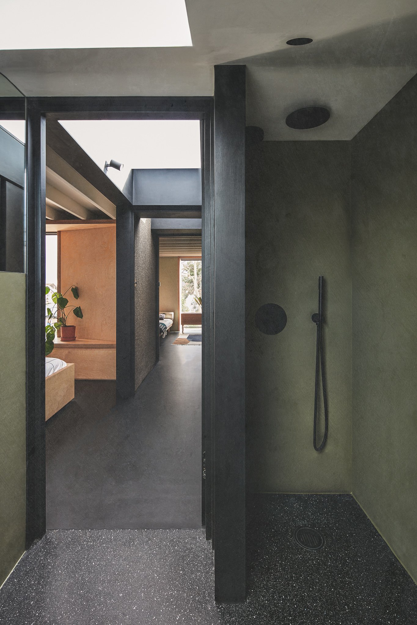
To get the most out of the loft space, we wanted to create a sense of containment for the master bedroom and ensuite that could also be opened out to create a natural sense of flow during the day or when not in use. To do this, we focused on the corridor and how it connects the rooms, particularly with light. We had to think about how the corridor could be sectioned off in a creative but practical way when needed. So we constructed a couple of bespoke doors fitted with magnets, one for the ensuite and one that closes off the corridor. When fully open at 90 degrees, they meet opposite an archway into the master bedroom and stay flush against the wall. When closed, that section of the corridor becomes floor space in the master bedroom.


On the walls we used a layer of rubber and cork, which creates interesting texture and contrast with the black framework and doors, as well as absorbing sound. Whether the doors are open or closed, light from the picture window hits this section come rain or shine, making a feature of the shadows and natural patterns it projects.


WINDOWS ON TO THE WORLD
As with every project, we consider the strategic placement of windows to provide the maximum amount of light in a property. Two large roof windows along the length of the hallway create a corridor of light when the master bedroom isn’t closed off with the magnetic doors. The roof light in the hallway section next to the master bedroom has a black-out blind so that when the master bedroom is sectioned off, the room offers a sanctuary for sleep. Where we can, we also look to create a direct line of sight from one end of the property to the other. Thinking about when the corridor is fully opened up, we placed a skylight in the sloped roof above the ensuite sink, which is at the front of the house. We also cut a bespoke mirror for the adjacent wall which meets the skylight frame, making the space feel larger and reflects light back in. At the other end of the corridor, the near full-length picture window provides another view, straight out to the garden.


The picture window in the master bedroom was made as large as possible while still offering an alcove to sit in. It was made safe with a glass balustrade so as not to obstruct the view. The integrated rollerblind hides within a recess complementing the frameless design, and again, maximising the view outside. We did the same for the picture window in the spare room which was almost floor to ceiling. The light from this window floods through to the loft corridor, meeting the light from the roof windows. When viewed from outside, this new, tall window would not have aligned with the bathroom window below. To give congruence and symmetry, we moved the bathroom window slightly so it was in line with the one above and added a dark blue-green panel in between them. This gives an even more elongated look from the exterior and creates architectural interest when viewed from the garden.
On the floor below, because the ceiling had been lowered, the bedroom window also needed to be lowered slightly. To counter this reduction in dimension, we removed a section of ceiling where it met the exterior wall and so exposed the eaves. This creates an illusion of height and makes good use of an area of dead space beyond the storage cupboards on the floor above.


THE FINER DETAILS
In the ensuite wet room, the green palette was actually created by using marmoleum on the walls, which offers an element of sound-proofing as well as an easy wipe-clean surface.

The look and feel was minimalistic monochrome but with shades of green and beige, wooden joinery throughout, and a pale pink for the stairwell which gives a warm, rosy glow when lit up. We used matte black accents from the rails and hinges of the wardrobes to the spotlights and light switches. This made the brass skirting really stand out as the only glimmer of metallic finishing.
The owners were very involved in the design process and enjoyed collaborating on choosing the colour palettes and selection of materials, which helped with a cohesive design language throughout. This kind of continuity really helps avoid the “added on” feel that can occur with extensions and conversions and is always a major design consideration for us at Rees Architects.


AWARDS
Winner of 'The Best Value Award' for the The Daily Telegraph Homebuilding & Renovating Awards 2023
Longlisted for the 2023 Don’t Move, Improve! Awards
Longlisted for the 2022 Dezeen Awards
IN THE PRESS
It has also been featured in Ideal Home where our Director, Daniel, spoke about how our team created a considered loft extension to create a balanced family home.
Embarking on a project?
We’d love to hear about it.
We truly appreciate your interest in working with our practice. Please complete our form, sharing as much detail as you can. Once we've received your submission, we'll be in touch to arrange a meeting with our Director, Daniel Rees.
Our residential projects typically have budgets starting from £500k, with costs generally ranging between £3-5k per square metre. This investment level allows us to achieve the quality of design and finish our practice is known for.