

BETHNAL GREEN
We designed a copper clad extension on the ground floor, and added a third and final hexagon to the second storey of this home in the heart of East London.


SCOPE OF WORKS
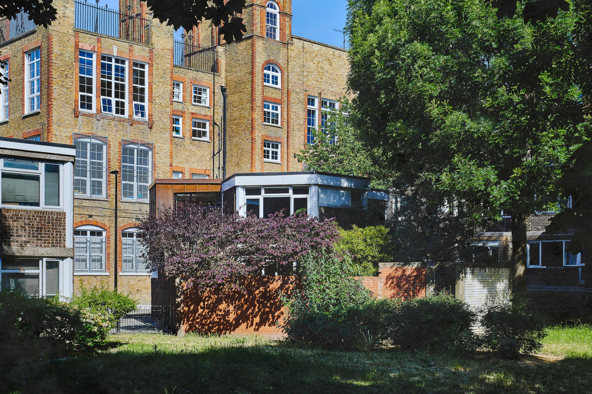
Rees Architects designed the extension and internal alterations to this detached concrete framed house in Bethnal Green, London. We were also responsible for planning, building regulations, some of the interior design and general site inspections. This included:
Architectural design of a alteration and extensions
Detailed design and specification, including external copper cladding
Internal alterations and redesign to accommodate a family member annexe
Window/external door design
Bathroom and kitchen design
Mechanical and electrical design (heating, lighting, sockets switches etc.)
Planning and building regulations
HIDDEN BRUTALISM
A house constructed of hexagonal units; not something you see often, but the signature of architect Noel Moffett (1912-1994). In fact, Ashington House was meant to be constructed entirely of stacked hexagonal units, but the Greater London Council rejected the original plans by Noel Moffet & Associates. Unperturbed, Moffett simply produced an asymmetrical design that combined more conventional quadrangles at varying floor levels with a flourish of concrete flying buttresses and staggered covered staircases. He did however, manage to include two single-storey detached houses in the plan which were originally intended for disabled tenants. The wide angles of the hexagonal units allowed for increased mobility. Inspired by The Giant’s Causeway (Moffett was Irish), German expressionism, and Neuman, Hecker and Sharon’s Dubiner Apartment House (which is based on 100 square-foot hexagons), these houses are considered part of one of London’s forgotten Brutalist masterpieces.
THE PERFECTION OF THE HEXAGON
The house already had a second storey built upon two of the three hexagons that make up the original design. Rees was commissioned to create an extension on the ground floor and to add a third and final hexagon to the second storey. The ground floor extension was to be annexed for a family member so we had to take into consideration that the building now needed two entrances. In nature, the hexagon is, of course, found in the beehive. It is considered the most perfect and efficient shape for the honeycomb because it’s the best way to divide a surface into regions of equal area with the least total perimeter (the honeycomb conjecture proven by mathematician Thomas C. Hales in 1999). The economy of this shape means that it has been adopted by Architects for Society with their Hex House model: flat-packed, scalable, modular and sustainable housing. It makes the foresight of Moffett’s design feel all the more visionary.


HIDING IN PLAIN SIGHT
The site is quite exposed in the grounds of Ashington House, at the apex of where Somerford Street ends and two footpaths meet. Yet, a cluster of ash trees provide screening from the main building and the courtyard feels surprisingly secluded with strategically planted small trees and bamboo. The challenge was to maintain this privacy and tranquility but also to create something modern and architecturally eye-catching, a point of interest for the curious passerby that didn’t feel out of place. The design needed to complement its surroundings and not be too outlandish, but at the same time enhance both the building and the neighbourhood.

CU LATER
In discussion with the client, we landed upon copper cladding for the upstairs extension. Not only would a light timber frame with cladding be more economical than a brick and block construction, it would be aesthetically pleasing. The raw copper has a deep umber hue to begin with which would keep it within the context of the estate’s dark brown brickwork. However, with time, the copper oxidises, gaining texture and verdigris. This gradual weathering in response to the elements means that the structure almost feels like a living thing that undergoes metamorphosis. It will take on a green patina but not before it has become part of the urban landscape.
DURABLE, LIGHTWEIGHT, INSULATED
It was really important that the metal structure could breathe. It actually protrudes and overhangs slightly so that rain water drains off and away from the ground floor walls. There is also venting and capping beneath the cladding for ventilation and to avoid damp setting in from condensation. The original structure meant there was a slab of concrete on top of the ground floor that created a cold bridge so this overhang nicely creates a barrier to cold air. Insulated plasterboard retains heat within the structure. The copper cladding is interlinked at the seams allowing for expansion and contraction of the metal throughout the seasons. The seams, although functional, provide congruence and texture. Copper trim along the top of the ground floor extension neatly ties in the new material across the structure. The client sourced similar bricks as well as re-using some of the originals for the ground floor extension so there was no obvious break between the old building and the new work.


PLAY ON LIGHT
Since the site is exposed to the street and encircled by footpaths that run through the estate, the original design used block windows. These allow good natural light in from a height but avoid giving pedestrians a view into the interior. For this reason, we replicated the block window design for the annexe’s kitchen to mirror the one at the front of the main building. We then fitted a sleek, double-glazed box window in the studio which also opens out directly onto the south-facing courtyard with a glass panelled door. Due to its position, it gets wonderful sunlight which, filtered through the trees, creates dappled shadows on the parquet floor. We fitted a skylight into the roof for even more light in the snug but deceptively spacious living area. Since it transforms into a bedroom at night, the skylight has an electric blackout blind. The annexe’s shower room is small but perfectly formed, as is the kitchen (with utility cupboard), behind a sliding panel door to keep out noise and smells. The interconnecting door to the annexe is acoustically treated, keeping noise from crossing over and offering privacy.
KALEIDOSCOPIC ANGLES
The second storey extension allows for an expansive window which takes up almost a whole wall and overlooks the courtyard. The roof in front of the window contains the annexe’s skylight and is surrounded by low-maintenance alpine plants which will grow and create more greenery with the trees as a backdrop. Due to the angle of the building, despite the picture window’s width, it still maintains privacy while allowing in as much daylight as possible. The upstairs shower room also has a skylight and a floor-to-ceiling frosted window. It’s unique shape lends itself well to the wet room which recedes into the corner, but the Escher-like tiling (chosen and sourced by the client) gives the illusion of even more space. From the hallways both upstairs and downstairs, you can catch glimpses of all the different rooms and corners of this unusual abode. The thoughtful decor and paint colours give the impression of a jewelled and vitreous kaleidoscope, every single view a composition of interesting angles and perspectives.
Embarking on a project?
We’d love to hear about it.
We truly appreciate your interest in working with our practice. Please complete our form, sharing as much detail as you can. Once we've received your submission, we'll be in touch to arrange a meeting with our Director, Daniel Rees.
Our residential projects typically have budgets starting from £500k, with costs generally ranging between £3-5k per square metre. This investment level allows us to achieve the quality of design and finish our practice is known for.