

WANSTEAD
Located in the Wanstead Village Conservation Area, we extended this property to the rear, revamped the ground floor décor, and ensured a seamless space for the homeowners who love entertaining.

Rees Architects designed the extension and refurbishment to this Victorian terrace house in Wanstead, London. We were also responsible for planning, building regulations, and bespoke joinery for the build. Adhering to conservation regulations, our proposed structural and layout updates were approved without any modifications.
This included:
Single storey rear extension and landscaping.
Alterations and redesign to the ground floor layout.
Full bespoke kitchen design.
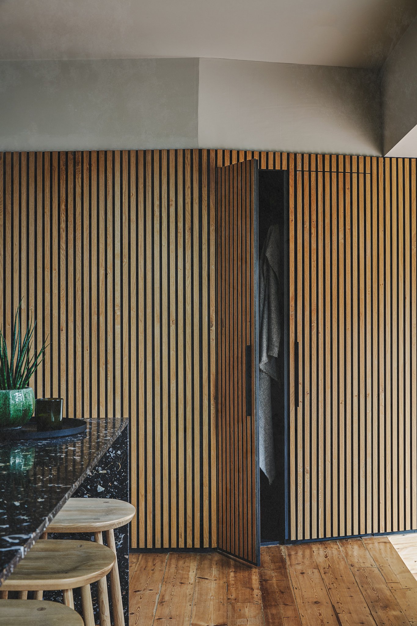
Bespoke joinery design, including bench seat, oak cladding, and cloak cupboard.
W/C design.
Full interior design, lighting design and decorations throughout the ground floor
and up to the first floor landing.


BREATHING LIFE INTO ORIGINAL MATERIALS
The cohesion we created in this project and in all our work is mainly down to respecting the structures we are given to work with. This is particularly important when working on houses in conservation areas. We work with the characteristics of the property to ensure that any extension work exists in harmony with what’s already good about the space. Often this means maintaining architectural and period features, as well as repurposing material. It goes without saying that the added benefit of this is sustainability.


For this extension, we retained as much of the brickwork as we could from the walls that were removed. These were re-used in a way that creates interest, but also a sense of solidity that integrates with the existing structure. For example, rather than using a metal wrap along the top edge of the extension’s sloped roof as is the norm, the parapet was created by laying bricks end-on. We also hid the sliding door runners behind the brickwork which takes a bit of planning and precision, but the results are worth it.
In the kitchen-diner area and the living room, we sanded and oiled the original floorboards, giving them a new lease of life. This complements the oak cladding and the timber kitchen cupboards. The fireplace in the living room received some repairs and the black stone hearth was made flush with the wooden floor. Beautiful original floor tiling in the hallway also just needed a bit of a touch up so it could shine to its full potential.

TAKING THE LONG VIEW
Our first step was to take the wall down between the kitchen and the dining room to make one large space. Originally, the entrance to the kitchen branched off the hallway. This configuration meant you immediately walked into a corner of the kitchen when you entered the room. We wanted to create a line of sight from the front door to the back garden through the kitchen door. The sense of flow from front to back dictated the structure of the extension, which is a long room that makes the kitchen-dining space into an L-shape. This extra space multitasks as a dining area, a study-work area, and as a sun trap where the owners can hang out and relax on the built-in bench.


CREATING FLOW
The space was originally laid out in a way that felt ‘boxy’ with the kitchen, dining room, and living room all separate, and the kitchen layout was not very intuitive. The concept of a separate dining room feels quite dated and we wanted to create a large, convivial space where people could gather around the kitchen island, enjoying drinks and chatting, while dinner or lunch was being cooked. However, the dining room had some attractive features that the owners were keen to keep, such as the cornicing and ceiling rose, the bay with its glass doors onto the garden, and the chimney flue (which we also needed to keep to maintain structural integrity). This project was never going to be a basic, full elevation extension and we knew we could work more organically with the space for a more interesting design result, both aesthetically and practically, that respected the original structure.


We installed a floor-to-ceiling window at the end of the extension to facilitate an enticing view from the front door through to the garden beyond. To add extra spaciousness, glass sliding doors open out onto the garden and increase the sense of bringing the outside in on warm, sunny days. We used the same terracotta tiles for the patio as for the extension floor for a seamlessness between outdoor and indoor. Running diagonally in the garden, they break up some of the previous ‘boxiness’ and run parallel with the raised outdoor seating area that provides another suntrap for summer evenings.


LENDING WARMTH TO CLASSIC MONOCHROME
The owners wanted a grown-up approach to the décor and although there is an uncluttered minimalist aesthetic, this is very much a lived-in space, where a lot of cooking, socialising, and everyday activity happens. The monochrome palette is warmed up by different textures and materials, from the oak cladding that leads down into the extension to the terracotta floor tiles in the new space.
The black terrazzo of the kitchen island breaks up the solidity of the structure with its flecks of light, neutral tones. On the breakfast bar side of the island, in the recess, we used blackened steel which has an attractive patina, and was lacquered to avoid corrosion. On the opposite side, the kitchen drawers are made with matte black Fenix, a durable smart material. This means that any scratches or scrapes from utensils will heal themselves and not affect the matte black surface. It’s also antibacterial, water repellent, and mould-proof – all great properties.


When using a variety of materials, we look to the structure to provide cohesion. The datum line creates a uniform edge that offers coherence for the timber cupboards, the white quartz splashback, and the oak panelling. Above that line we used an off-white paint which corresponds with the walls of the hallway and the living room.
Black paint highlights the detailing of the dining room ceiling and gives it a contemporary feeling. This echoes the staircase in the hallway which was also painted black and can be glimpsed through the kitchen pocket door when open.


Since the space is large and without soft furnishings, we added black felt to the back of the oak panelling to give some extra acoustic absorption to this busy space.

USING SPACE STRATEGICALLY
Because we needed to keep the chimney flue intact in the dining room, a wall of tall storage cupboards was installed in front of it to house the washing machine, tumble dryer, a fridge-freezer, and pantry space. The central pantry doors fold out 180 degrees offering an open preparation area for coffee. We also painted the interior black and used Valchromat MDF. The wood fibres of this material are infused with organic colouring agents so that if accidentally scratched, it isn’t very visible. We used the lines and shadows created by the chimney above the cupboards to give the space a bit of drama that added to the light and shade of the monochrome colour scheme throughout.
The oven and hob, which are integrated into the kitchen island, have a downdraft extractor in keeping with the clean lines and minimalism. This was engineered to run beneath the floor and outside.


Hidden away behind the oak panelling are a couple more cupboards for cleaning equipment and coats. The doors are flush with the panelling and black wrap-around handles make them look frameless.


Through the oak panelling is also a door which leads to stairs that go down to the cellar. As there was originally an outdoor toilet (which inevitably got used for storing garden tools) we had to figure out the best place for a downstairs loo. This was between the cellar stairs and the storage cupboards. The fairly small space was made to feel larger by softening the edges of the room with a rounded ceiling, adding a circle mirror, and using a warm blush shade of paint. We used waterproof paint below the imaginary dado line making it easy to wipe clean. The black stone floor is a nod to the terrazzo island in the kitchen, tying the décor together once again.


IN THE PRESS
Our Wanstead project was featured in Livingetc - with an emphasis on how our clever design trick with terracotta tiles created a seamlessness between the indoor and outdoor, while making a narrow space seem wider.
Read the full feature here.
Embarking on a project?
We’d love to hear about it.
We truly appreciate your interest in working with our practice. Please complete our form, sharing as much detail as you can. Once we've received your submission, we'll be in touch to arrange a meeting with our Director, Daniel Rees.
Our residential projects typically have budgets starting from £500k, with costs generally ranging between £3-5k per square metre. This investment level allows us to achieve the quality of design and finish our practice is known for.