

WALTHAMSTOW
Through a clever design to keep all structural elements hidden, we designed a clean, seamless extension for this home in Walthamstow.

Rees Architects designed the extension and internal alterations to this Victorian terrace house in Walthamstow, London. We were also responsible for planning, building regulations, interior design and kitchen design for the build. This included:
Architectural design to remove existing wrap around the old extension/conservatory and replace with a complete side and rear extension.
Internal alterations and redesign to make better use of space and improve flow.
Landscape design for the garden.
WC design.
First floor bathroom design.
Full kitchen design (Ikea carcasses with bespoke doors, handles and worktops).
Specification and design of finishes.
Mechanical and electrical design (heating, lighting, sockets switches etc.).
Specialised detailing for roof window, frameless patio doors and picture window.
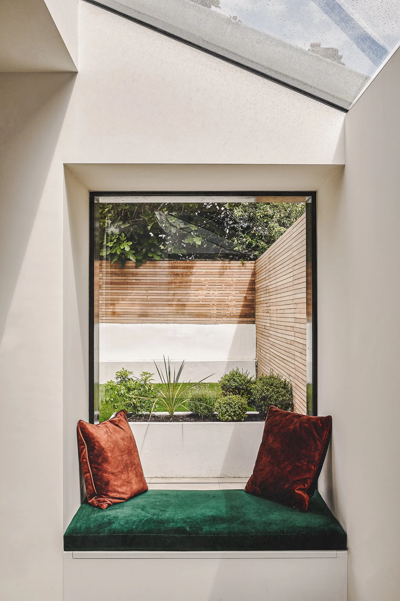
Bespoke joinery design for window seat and utility cupboard.
Detailed design and specification for external timber cladding.


A CLEAR LINE OF VISION
We re-configured the ground floor layout so that when you enter the house you have a direct view of the garden from the entrance hall, welcoming and drawing you further in to the home. This line of vision is also at play from the living room where you can see all the way into the garden framed by the picture window seat. The interconnection between the front and rear without being completely open plan makes for a happy medium; there are small intimate spaces, but you’re never cut off from any other activity going on across the ground floor. This innate sense of flow was foundational for the rest of the design.

LET THERE BE LIGHT
The position and size of the windows and doors needed to work as much with the external appearance as they did with the internal layout, which required a fair bit of strategising on our part. In particular, because the extensions to the side and rear made the centre of the kitchen-dining room dark, we ensured that the large frameless roof window was as large as possible to flood the room with natural light.


MAINTAINING MATERIALS AND REPURPOSING
The other remaining bricks retained from the demolition works were used to build the new side wall on to the neighbour’s property. We painted the extension’s timber cladding with a black stain and UV protection, this allowed some of the natural tones and grain of the timber to come through but provided a hardwearing matte finish. The black timber cladding then extended across the side wall of the other neighbour’s rear extension. This wall was in very bad condition, so we were able to hide it while continuing the datum line from the top of the patio door across into the garden. It also acts to balance out the proportions of the box extension and draws the eye into the outdoor space.

CLEAN LINES, SEAMLESS SPACE
Key to a clean minimal design is keeping all structural elements hidden, so we gave special attention to hiding window frames as well as rainwater pipes and guttering within the structure. The steelwork and door frame over the rear patio doors are cleverly hidden behind the brickwork above. We had retained some of the existing bricks from the removed side wall to rebuild this wall above, a bit of visual trickery that makes it unnoticeable. This finish looks deceptively simple and clean in the photos, but it’s a particularly tricky design detail that required a lot of forethought to be carried out successfully.
FUNCTIONAL TO ITS CORE
Designating the more light-filled space for everyday living, we secreted the WC under the stairs, which was now the darkest part of the house. Carrying this new space across the back of the kitchen created a large utility and boiler cupboard hidden behind two white acoustic doors which reduces any noise from the washing machine or dryer. The patio doors were also perfectly sized to stack-up behind the wall of kitchen cupboards, leaving the maximum opening out into the garden. Doubling as a toy chest, the picture window seat invites a cosy play corner in the heart of the home.

ROOM OUTDOORS FOR SUMMER LIVING
We made the kitchen and patio the same level and the external tiles received a clear non-slip coating, so they look identical to those in the kitchen (the patio door frame was recessed into the floor and a small drainage channel in front of the door stops any water coming into the property). This continuity across the inside and outside space when the doors are open on warmer days adds a real openness. Originally there was a step down on to the patio, this then sloped up to the rear of the garden. We used excess earth from the levelling of outdoors with indoors to provide a raised lawn area at the rear. White box planters and in-built seating reflect as much light as possible. Because the garden is north-west facing, this action of stepping up into light rather than stepping down into a dark space is a literal uplift. Plus it provides the perfect spot for a post-work drink, a weekend get-together, and those summer barbecues!

DARK COLOURS CAN ADD DEPTH
It may feel counter-intuitive, but we decorated with dark colours in both the bathroom and the WC to create the illusion of depth as this softens corners and edges. It also added a dose of drama to the functionality of these rooms that we further embellished with wallpaper in the WC. We used pieces of reclaimed furniture and brass fittings to create character and warmth. The high contrast of dark and light when stepping back out into the white-walled living space then upholds the sense of expansive space that we were aiming for throughout.
Embarking on a project?
We’d love to hear about it.
We truly appreciate your interest in working with our practice. Please complete our form, sharing as much detail as you can. Once we've received your submission, we'll be in touch to arrange a meeting with our Director, Daniel Rees.
Our residential projects typically have budgets starting from £500k, with costs generally ranging between £3-5k per square metre. This investment level allows us to achieve the quality of design and finish our practice is known for.